Reimagining a city’s identity through digital storytelling.
Live in Santa Maria
I developed a cohesive branding system—from logo to website—celebrating Santa Maria’s connection to the California coast. Through using design as a tool for reflection and empathy, I explored how visual systems can reshape perception, demonstrating my ability to adapt, reframe experiences, and evolve over time.
01.
Branding
02.
Figma
03.
Systems Thinking
04.
Adobe Illustrator
05.
UI/UX Design
Skills Demonstrated
Santa Maria’s city website and branding were cluttered, inconsistent, and difficult to navigate. The visual identity failed to capture the warmth and character of a coastal California city known for its agriculture, barbecue, and beaches.
My goal was to redesign the brand and homepage to:
-
Improve hierarchy and information clarity
-
Create a sense of place through cohesive visual storytelling
-
Build a flexible system adaptable across digital and print
The Challenge
Site Audit
I navigated through Santa Maria's city website, immediately noting the overwhelming amount of information, lack of hierarchy, and unscalable logo.

Iterations + Wireframes
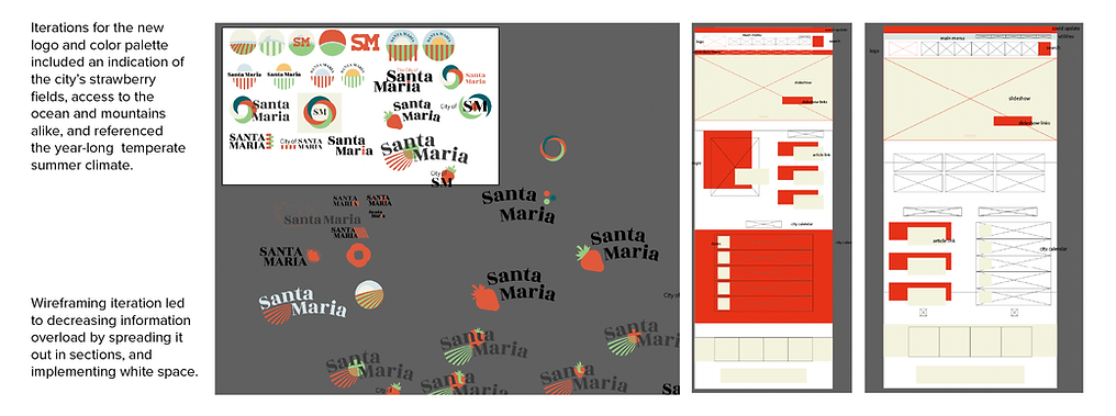

Santa Maria is defined by its warmth, sunny beaches, the smell of tri-tip barbecue, and the glistening fields of ripened strawberries. It's an unsung classic of the West Coast.


The Outcome
-
A responsive logo system that scales across mediums
-
A redesigned homepage with clear visual hierarchy and accessible color contrast
-
A brand language celebrating Santa Maria’s coastal and agricultural roots